Design Awards: The most beautiful bottles in the world
Today the IWSC unveils the most beautiful bottles in the world: the winners of the Design Awards 2019.
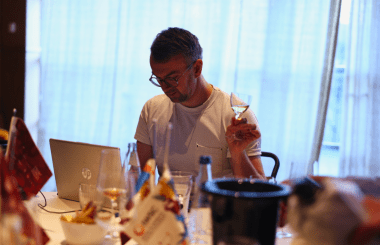
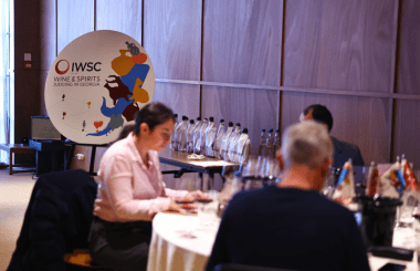
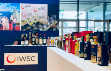
Drinks and design experts Neil Ridley, Rashna Mody Clark and Ivan Mato judged over 250 entries across three categories in the IWSC Design Awards, which reward innovation, creativity and brand personality in wine and spirit artwork, bottle design and packaging.
“Packaging is hugely important,” said drinks presenter Ridley. “With such a massive breadth of products on the shelves, it has to be as important as what’s in the bottle itself.”
“What I’m looking for when judging these products is originality, innovation within the category, and a sense of place and purpose,” he said.
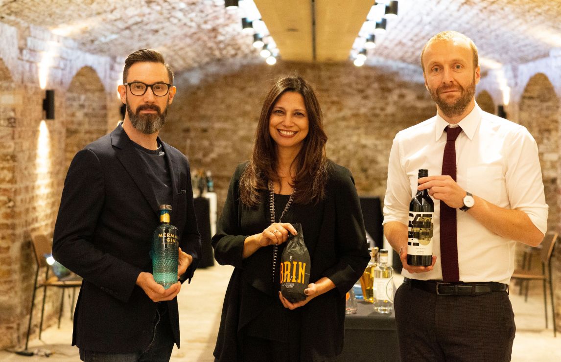
The judges crowned three winners: Patritti Merchant Shiraz 2017 (Wine Artwork and Bottle Design), BRIN Gin (Spirits Packaging), and Mermaid Gin (Spirits Artwork and Bottle Design). These entrants championed innovation and originality in their designs, while a range of other bottles have been awarded ‘Highly Commended’ in recognition of designs that showed clear signs of creativity and brand personality.
Wine Artwork & Bottle Design
Winner (far left) – Patritti Merchant Shiraz 2017
Meaningful and memorable, this is a beautifully simple and elegant label that demands attention in a completely honest and authentic way. It marries the old with the new, combining photography from the rich archive of the Patritti family with bold, striking, furiously contemporary typography. The label is balanced and timeless, reflecting family history and Italian styling.
Highly commended – Focal Point Cinsault 2018
The name and graphics come together to create a very memorable label that stands out from the crowd. The use of geometry is refreshing, and the graphic adds simplicity and clarity. Deceptively clever with a real sense of perspective, it is pure and stylish, with the whole piece considered to the last detail.
Highly commended – De Bortoli Florence Broadhurst Botrytis Semillon
The use of celebrated Australian artist Florence Broadhurst’s illustration and prominence of the artist’s name adds another level of meaning to the bottle, which is both elegantly designed and very striking with the die cut label. The contrast of the black and white label and amber wine is very arresting, giving an overall appearance of sophistication.
Highly commended – Wotr Milf by Popa Art Projects 2013
Cheeky, artistic and rock ‘n’ roll, everything about this modern illustrated label is unexpected. Creatively executed incorporating the typography within the illustration, it has a streak of rebellion about it and inspires the drinker to take a closer look – a striking approach which stood out from the crowd.
Spirits Packaging
Winner (far right) – BRIN Gin
This packaging was instantly appealing for a number of reasons: the striking colour scheme, modern typography, and inventive paper wrap – the opening of which is beautiful in its simplicity. The tactile experience of unwrapping and revealing the bottle within was very well received, and the bottle was beautifully designed and embodied genuine craft.
Highly commended – Dewar’s Double Double 32 Years Old, Dewar’s Double Double 27 Years Old and Dewar’s Double Double 21 Years Old (Range)
A whisky bottle in iPhone packaging: this was a modern interpretation of a classic and high end whisky, packaged impressively and impeccably. The approach is unconventional, modern and eye-catching, and the bottle design is particularly impressive in the way they seem to zig zag when seen together.
Highly commended – Unit 43 Gin
This packaging is beautifully executed: vintage in feel with the illustrated wrap and modern, clean label design. The bottle is interesting and very well printed, with clear and concise story-telling.
Highly commended – AMASS Dry Gin Los Angeles
This has great shelf appeal and embodies a great take on apothecary: simple, clean lines on the label with straightforward copy. The monochrome, almost scientific approach to the packaging is very refreshing and contemporary, particularly with the marble effect on the box and the stark black and white label.
Highly commended – Salcombe Gin ‘Island Queen’
This elegant bottle and inventive box design show plenty of craft on display; the gold highlights the white beautifully and the Pantone of the label was very well matched.
Spirits Artwork and Bottle Design
Winner (far right) – Mermaid Gin
This bottle is exceptional: perfect at every possible level. This is a gin with a sense of place and provenance, a beautiful symbol of the Isle of Wight with its marine motifs. It perfectly highlights the story of the distillery, and the scales and graduating colour give a beautiful representation of the sea and island life. Impossible to ignore, this was the stand-out piece in the room. A highly innovative design and a worthy winner indeed.
Highly commended – Kyro Dairy Cream
The best written bottle in show; beautifully simple, with a timeless Scandinavian design ethos on display. The font and logo feel very well thought through with a very contemporary type-led aesthetic, and the storytelling on the back is tremendous.
Highly commended – Achroous Gin
Absolutely uncompromising and beautiful in its brutality, this is an amazing piece of inventive and unusual product design that captures your attention. The colour is integral to the concept, and the logo is beautifully printed and designed. Seeing the bottle with a light behind it also brings a fun element to the packaging.
Highly commended – Lindores Abbey Distillery Aqua Vitae
This is a bespoke, unusual bottle design which highlights the historical nature of the spirit. The bottle is working really hard to communicate a feeling, a provenance, a flavour and an origin, and it does so very elegantly.
Highly commended – Palma Gin Destilado
The bottle beautifully captures the idea of Mediterranean gin, with the striking patterned design reflecting the designs on the tiles from Palma. The colours are stunning and evoke classic styling, giving a genuine sense of place to the bottle. A refreshing approach to the design and production methods.
Highly commended – Longtooth Gin
A very appealing, intricate patterned design which is both cool and opulent. The simplicity of the clear, rectangular bottle shape contrasts strikingly with the background pattern design of the tiger motif, giving the tiger a strident feel.
Highly commended – Dewar’s Double Double 32 Years Old, Dewar’s Double Double 27 Years Old and Dewar’s Double Double 21 Years Old (Range)
This works really well as a series with the four-sided bottle design and application of the label. Nicely modern and a brilliant piece of typographic arrangement, taking its cues from sample bottles and science lab design.
Highly commended – Seven Crofts Dry Gin
This elegant, fluted bottle design with an ombréeffect from emerald green to white was very impressive visually. The simplicity of the label didn’t compete with the bottle but enhanced the overall effect. A beautiful, glamorous and elegant bottle.
Highly commended – Wodka Linia
The simple graphic motif cuts through all the floral referances and ornate illustrations so typical of the category. The confidence of the black and white bottle with the simple graphic catches your eye. It is simple in execution, with the modern take on the word ‘Line’ reflected by the diagonal line design, but effective and very premium on-shelf.
Highly commended – Chinnery Gin
This bottle is colourful, playful, and very well executed with the die cuts and the fact that you can see inside the windows to reveal colourful designs within the bottle. Clever and sweet, it harks back to a vintage 20s feel and really delivers on the themes of the China trade, Dublin facades, and the homage to George Chinnery.
Keep up-to-date
Subscribe to receive email updates from IWSC, including newsletters, information about competitions, events, deadlines and awards.