IWSC unveils the 2020 wine and spirit design and packaging winners
On today’s crowded shelves – and social media channels – the way a drink looks is just as important as how it tastes. And since our tasters never see the bottle they’re scoring in our main awards, packaging takes centre stage in our Design Awards. Here, we reward innovation, creativity and brand personality in bottle artwork, design and packaging.
This year's judges included Rosie Milsom, global head of new product development at Atom Brands; Bryan Rodriguez, buyer at Harvey Nichols; and Ivan Dixon, former wine and spirits buyer for Harvey Nichols and Enotria&Coe.
Only the very best were crowned the Winner or given a Highly Commended medal in their category – here are the results, along with the judges' comments:
Spirits Packaging
The Patito Ruso Company Picofino Fabuloso Gin Fusion Vermut - WINNER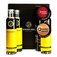
Spain
Bright and bold, this will definitely stand out on a shelf. The tactile qualities on the label and stamp are fantastic, really elevating the product – and the closure is great too. The simplicity of the secondary packaging is incredibly stylish and has clearly been well thought through.
Greenwood Distillers Theodore Pictish Gin
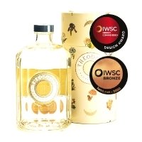 W&R - HIGHLY COMMENDED
Highland, Scotland
The illustrations and colours on the tube are stunning. The open, close and twist actions of the packaging are smooth. The bottle itself is beautiful and understated, and the hue of the liquid shines through. We loved the use of the label/emboss combination on the front.
Hallasan Heo Beok Korean Soju - HIGHLY COMMENDED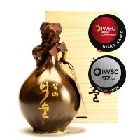
South Korea
We loved the little handles and the combination of the string and material at the mouth. It feels great in the hand and the box feels rustic and natural. This has the added benefit of being reusable in a plethora of ways!
Spirits Artwork & Bottle Design
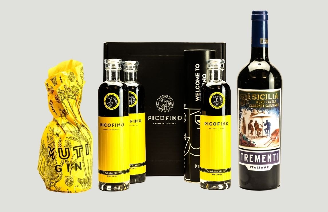
New Harbour Distillery Muti Gin - WINNER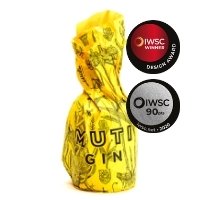
South Africa
The judges' favourite! We were initially drawn in by the beautiful botanicals on the bright yellow paper, which are reminiscent of sunshine. The paper crinkles in a really nice way around the top of the bottle. Then, when you begin to unwrap it, you feel a little cuff around the neck which is colour-coordinated with the cork. The use of darker glass here, contrasted with the yellow in the logo is stunning. And the tactility on the logo… wow!
Cantium Spirit Cantium Gin - HIGHLY COMMENDED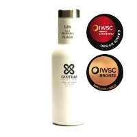
England
This is a great concept and gets lots of points for sustainability. We'd love to see it go a bit further in terms of refillability – you have a reusable vessel, so what's next?
Wessex Distillery Alfred The Great Gin - HIGHLY COMMENDED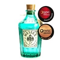
England
We love the use of the green glass and chunky cork – this is apothecary done well! The label is neat and sits well on the bottle. It feels very substantial in the hand and is incredibly giftable thanks to the little tag. The bottle could also be reused as a decanter or a vase.
La Fée Parisienne Absinthe Supérieure - HIGHLY COMMENDED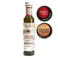
Rhone Alpes, France
This is brilliant, we love it! It's a nice, accessible size and gives consumers an opportunity to try absinthe without buying a full-size bottle. It also comes with a great recipe book and a little bit of history. The packaging is very true to La Fee and fits well with the brand identity.
Wine Artwork & Bottle Design
Orion Wines Trementi Nero d'Avola-Cabernet Sauvignon 2018 - WINNER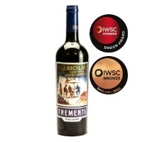
Sicily, Italy
This has a lovely vintage feel to it. It's very stylish and the illustration sweeps you straight to Italy. We liked the use of the double-label and the foiling offsets the design very well.
Tenute Recchi Franceschini Donna Eugenia 2015 - HIGHLY COMMENDED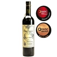
Piceno, Marche, Italy
This is so charming! It has quite a young feel to it in a romantic way. You could almost imagine each bottle being illustrated by hand, and it doesn’t get any more personal or special than that. It definitely catches the eye.
Hammeken Cellars El Gringo Dark Red Tempranillo 2018 - HIGHLY COMMENDED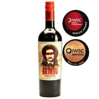
Castilla La Mancha, Spain
This label is bold, bright and really stands out. As you get closer you can see and feel the finish on the logo which elevates the label nicely. The way the colours are coordinated throughout is really satisfying to the eye. It also makes us want to find out more about the character and why he’s relevant to the wine. It gets you thinking through the design, which is a really nice touch.
View all 2020 results
Keep up-to-date
Subscribe to receive email updates from IWSC, including newsletters, information about competitions, events, deadlines and awards.